Santa Monica store is the first of the chain of new Nike retail concept to roll out globally, It has defined and established many programs as example to follow including: fundamental consumer journey, branded and seasonal based campaigns and its cadence, fixtures, materials, graphic programs and art installation program. The new Nike retail concept put the brand first and categories within the brand far below it in terms of its presence. The philosophy of establishing what the brand looks, feels and represents at physical retail space with consistency was put on a premium. As a part of brand communication eco-system (along with social, digital and on-products), giving the brand a "face" that consumers could associate with was an integral element to the system. Concept, art direction and design
Brand plaque at entry
Main brand sculptural element
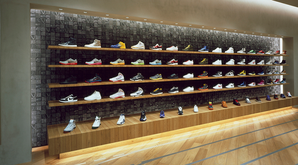
Furniture, Product display
brand graphic system
In-store exhibit display
Navigation display
product communication system
In-store brand story display
Nike + strategy
Fitting room strategy
I was a part of a team that put together the concept for Nike direct retail doors. The “Field House” concept was used as inspiration. We adopted, defined and translated it into the retail language that touched on a distinctive brand character to communicate its many stories.
Nike Store Harajuku, Tokyo
Runners service station
Nike Store Harajuku, Tokyo
Nike Store Harajuku, Tokyo
Nike Store Harajuku, Tokyo
Nike Store Scottsdale
Nike Store Scottsdale
In-store Nike iD concept
In-store Nike iD concept
In-store service concept
In-store Nike + service station
In-store Nike iD station
The commemorative Nike Elite socks box set packaging.
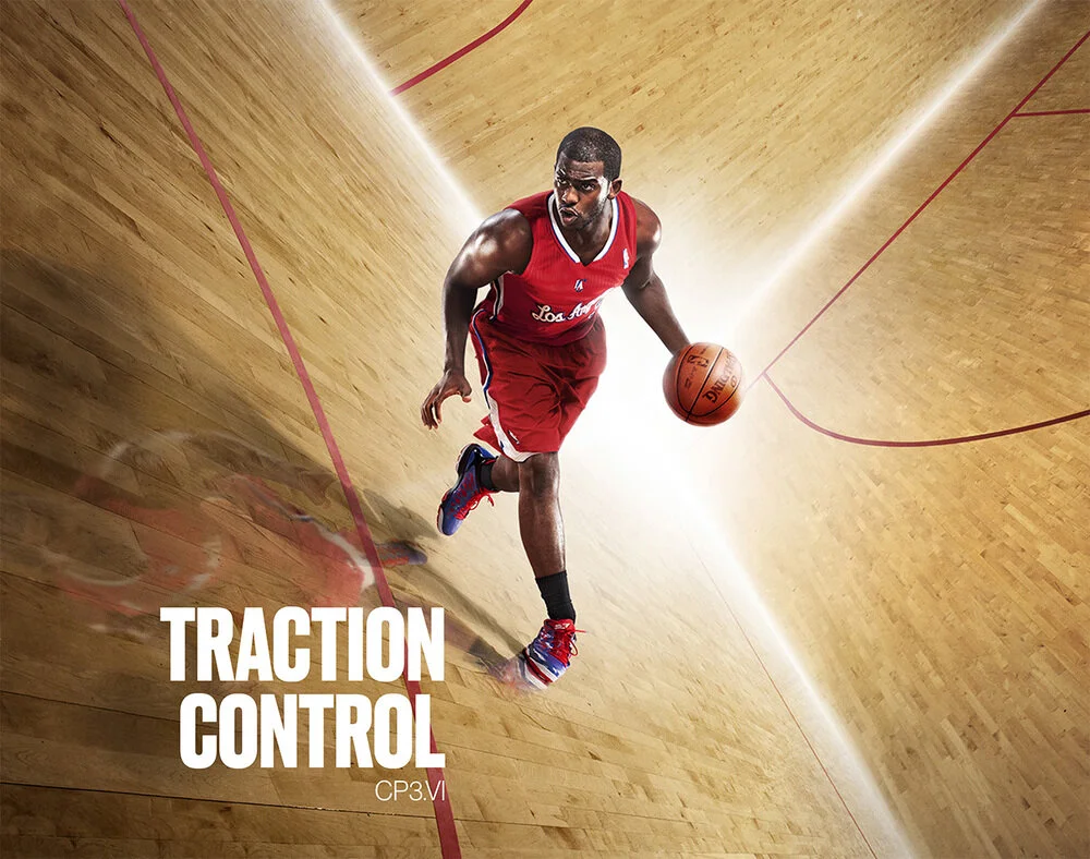
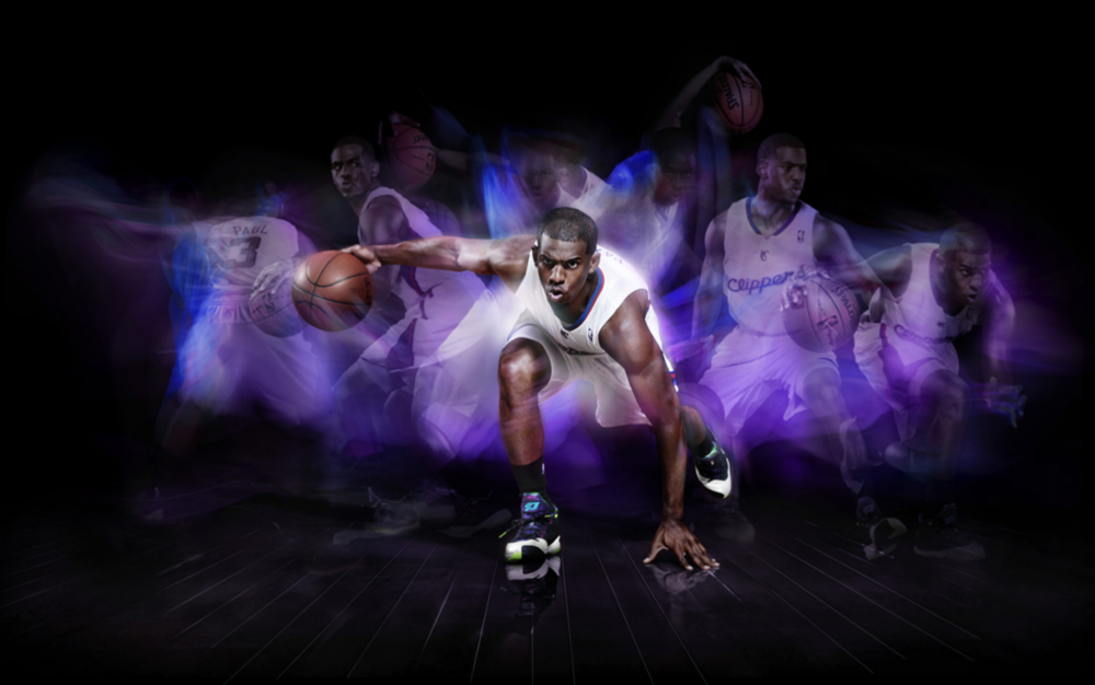
These are some of the campaign images created for launches of certain products. Concept, and creative direction.
As the brand had expanded so rapidly, it became necessary to stop and re-examine its own brand perception and see if the essence of the brand, the look and feel and what it meant to consumers were accurately represented and still relevant. We've visited everything from the very definition of the brand, photographic style, typography, color palette etc. The manifestation of this work, much simpler, bolder and soulful identity, was prevalent in everything that the brand produced, including a newly designed web site. Concept and creative direction.
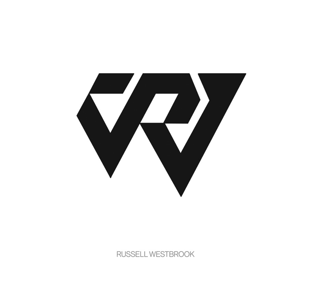
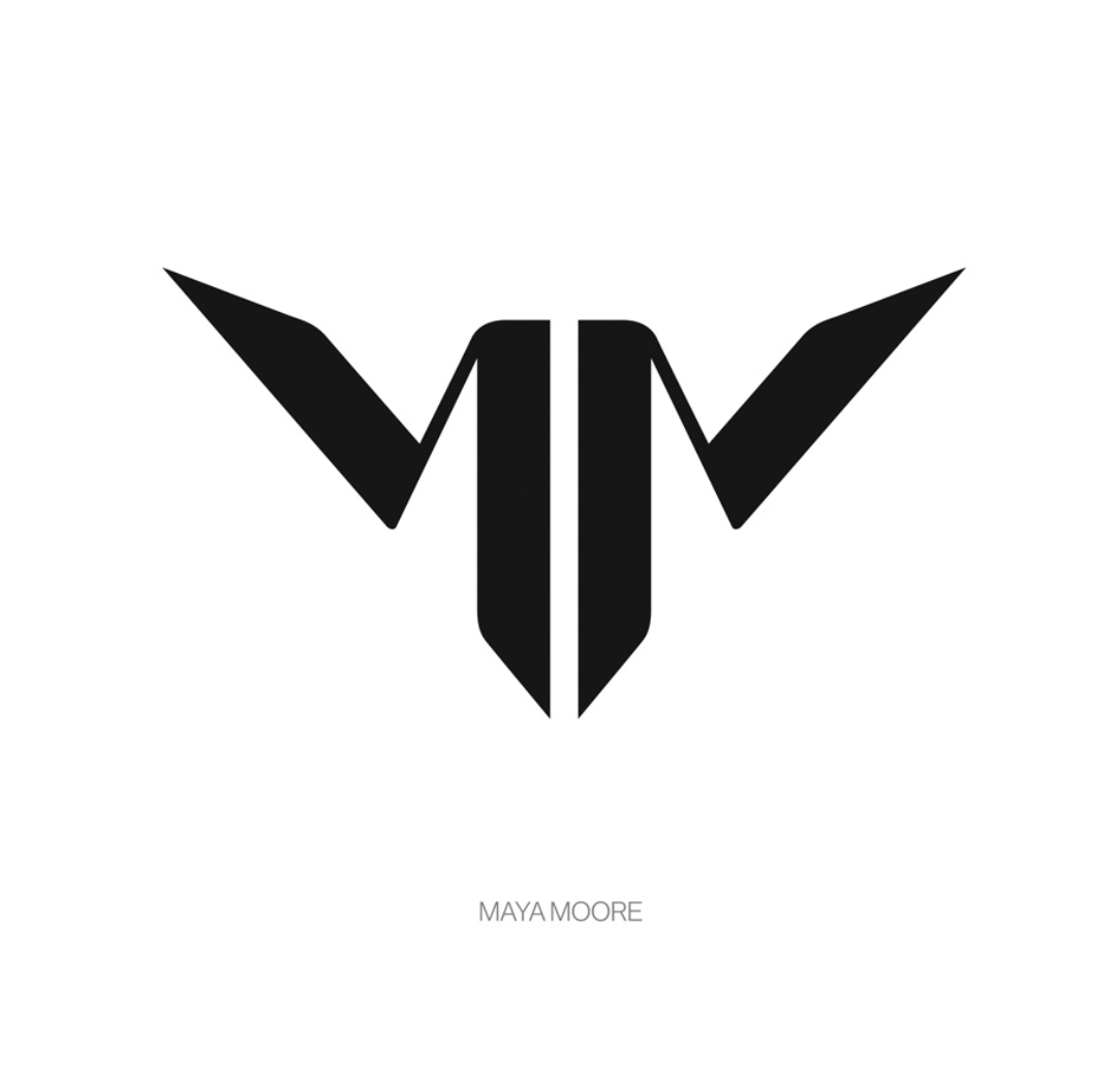
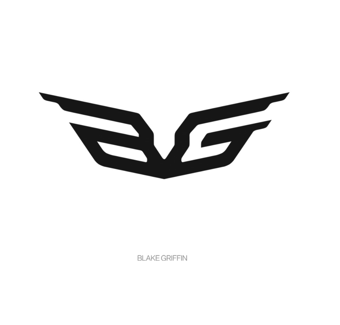
Creating individual logos while under the umbrella of a single brand, a consideration for both athletes and brand had to be integrated. In these marks, athletes’ unique attributes are expressed at the same time, all relating to one another as a “Brand of Flight”.
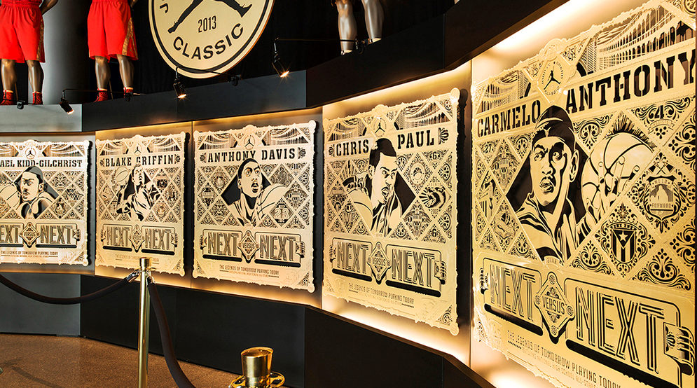
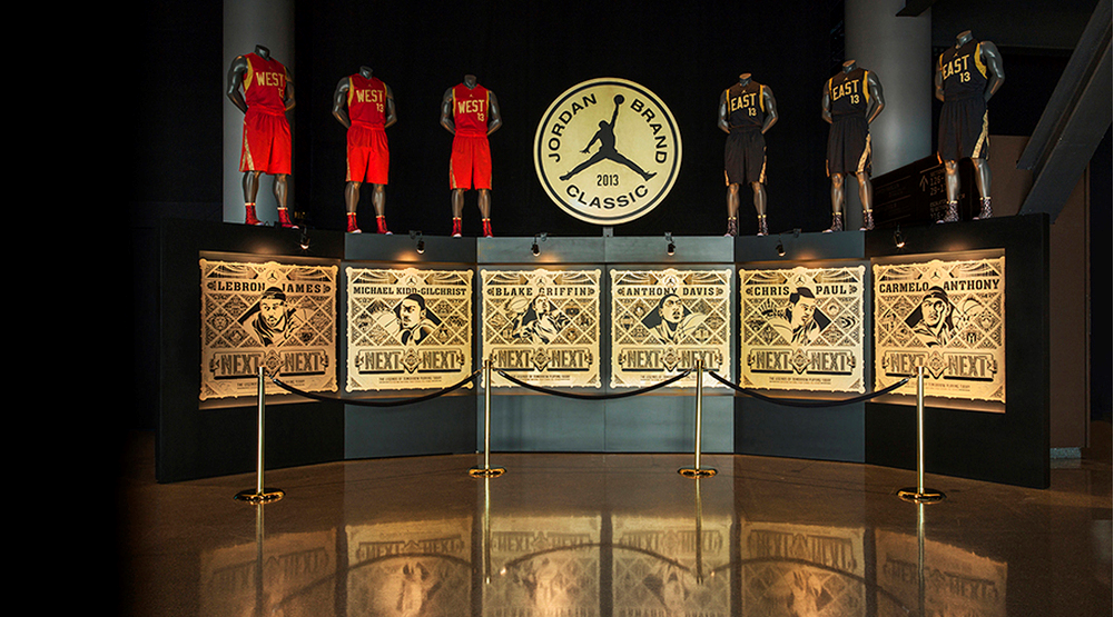
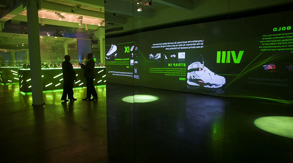
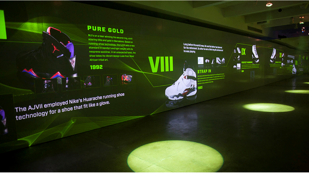
Samples of Jordan exhibit spaces, some of them to communicate to consumer, some to PR and some for both.
Art direction and design
JBC Exhibit
JBC Exhibit
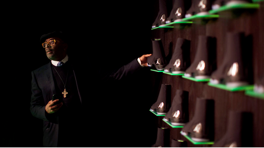
Product launch media event
Product launch media event
Product launch media event
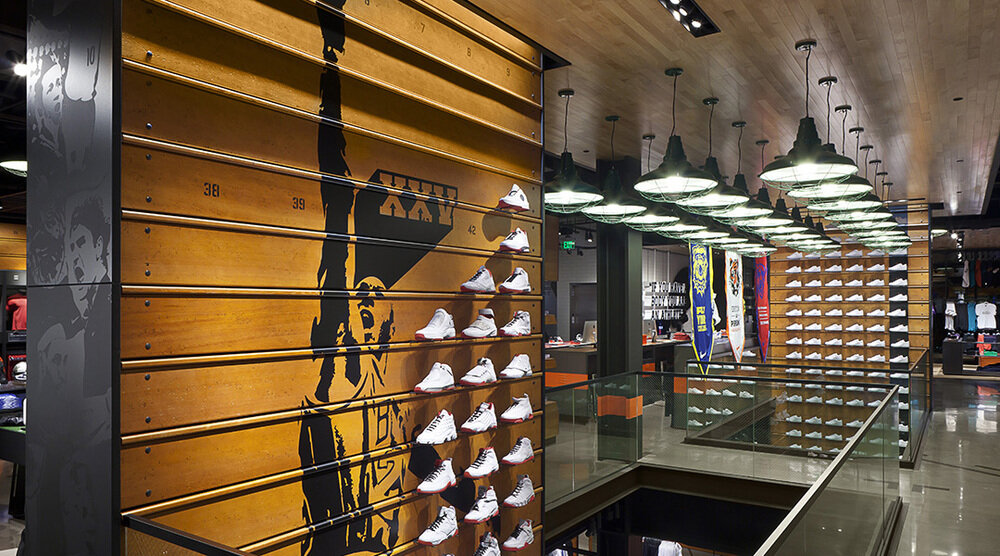
I’ve directed a team of designers and artists to create Brand Jordan’s first stand alone retail door, “Flight 23”.
Brand sculptural element
Brand sculptural element at off angle
Brand sculptural element, detail
Entry
Conceptual rendering
To commemorate Michael Jordan's 50th birthday we wanted to tell stories about his life in different ways than how they’ve been known by fans and industry people alike. 50 well known stories were given to 45 different artists. Some stories are publicly well know, while others are more personal in nature. The artists were free to artistically interpret them in their own way. A remarkably diverse and fresh expression of the otherwise well documented life of the man were curated. The art works were exhibited at a museum and later turned it into a cloth bound book. We've presented the book to him at a later date which was very well received. Concept and creative direction
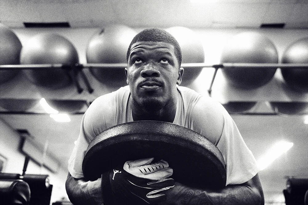
In order to establish a strong sense of Training category by Jordan brand, we focused on few key elements: honesty, personal, elegance and beauty. I wanted to go beyond gritty reality of unsung sweat. In the end, the images had to be beautiful while being authentic. Concept and creative direction